
Every year since 2017, the NBA has come out with “City Edition” jerseys: uniforms inspired by the team, the city and the culture surrounding them. They always garner much discussion on social media, so we asked our sports staff who they think has the best specialty get-up this season.
Cleveland Rocks
By Thatcher Zalewski
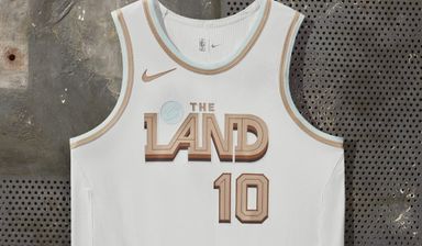
The Cleveland Cavaliers without a doubt have the best city jerseys this go around. There may not have been a wealth of good uniforms to pick from, but Cleveland made sure to stand out.
The jersey features a nice gold and light blue trim around the collar and the sleeves, with the blue being a throwback to their 90’s styles, when blue was one of the more prominent colors on the uniform. The gold brings a nice balance and completes the uniform all together. It’s a clean and simplistic look, but it stands out amongst the rest.
A Golden Idea for Golden State
By Rodrigo Perez
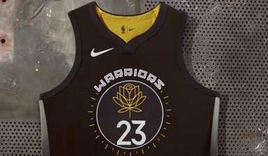
A good-looking jersey with a good message behind it, what more can you ask for?
As a tribute to women, designed by local artist Allison Hueman, a big yellowish/gold rose design fades below the mostly black jersey. Any jersey that has some black and gold elements will always get a high rating in my book, as it makes anyone look classy. It’s a rather unique jersey for the Golden State Warriors, so it ranks as my favorite.
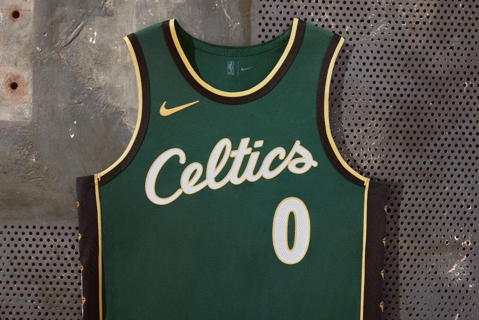
The Celtics honor an icon
By Mason Klemm
For a team that has historically made their city edition jersey look boring, the Boston Celtics nailed it this time around. The dark green offers a nice change of pace from the traditional brightness of their normal uniforms and the stylized script letters are also a good touch. They also paid homage to Bill Russell, the 11-time NBA champion who passed away in July and was actively involved in the design process. The gold trim is joined by 11 gold diamond icons down the sides of the uniform, representing all of the legend’s championships. You can never go wrong with a nice tribute, and the Celtics executed this perfectly.
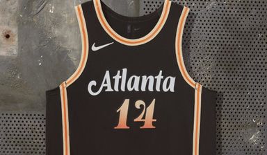
Atlanta Hawks jersey soars above all the rest
By Luke Kotcher
The Hawks jersey has to be the cleanest City Edition jersey out of all the NBA teams. The coloring for me is the best part, along with the font of the Atlanta text. With that, the colors in the numbers look amazing with the black jersey. I am not a Hawks fan, nor do I own a basketball jersey, but I might have to now. Atlanta should make these their permanent alternate jerseys to counter the red they already have.
Rip City has never looked so good
By Matt Lucas
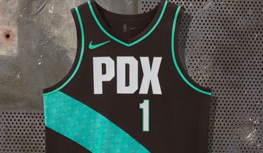
With a sleek black and bright teal tag-team, the Portland Trail Blazers hit on all cylinders with their City Edition jerseys this year.
Inspired by the local icon that is the Portland International Airport’s carpet, the uniform includes the airport code ‘PDX’ in white lettering while a bright teal ‘carpet strip’ stretches diagonally down the jersey. It’s a beautiful color combo, and a canvas where simplicity is king.