
Everyone starts with fundamentals that are taken for granted. Yet, what I increasingly find respect for are those fundamentals which rely upon the intuitive simplicity that they create.
Movies, shows and graphic novels have become too complicated in their pursuit of gimmicks and reverence for pointless detail and noise that distracts from the beauty they try to instill.
Obviously, when it comes to appreciating any type of media, it has to look good. But with such a subjective medium, it is easier to criticize what is lost when the simplicity is taken away.
Simplicity’s greatest and most important aspect is the lost art of readability. Having simplistic motivations means everyone can understand them and can insert themselves into the character’s shoes just as a piece of art that sheds details can be clearly parsed.
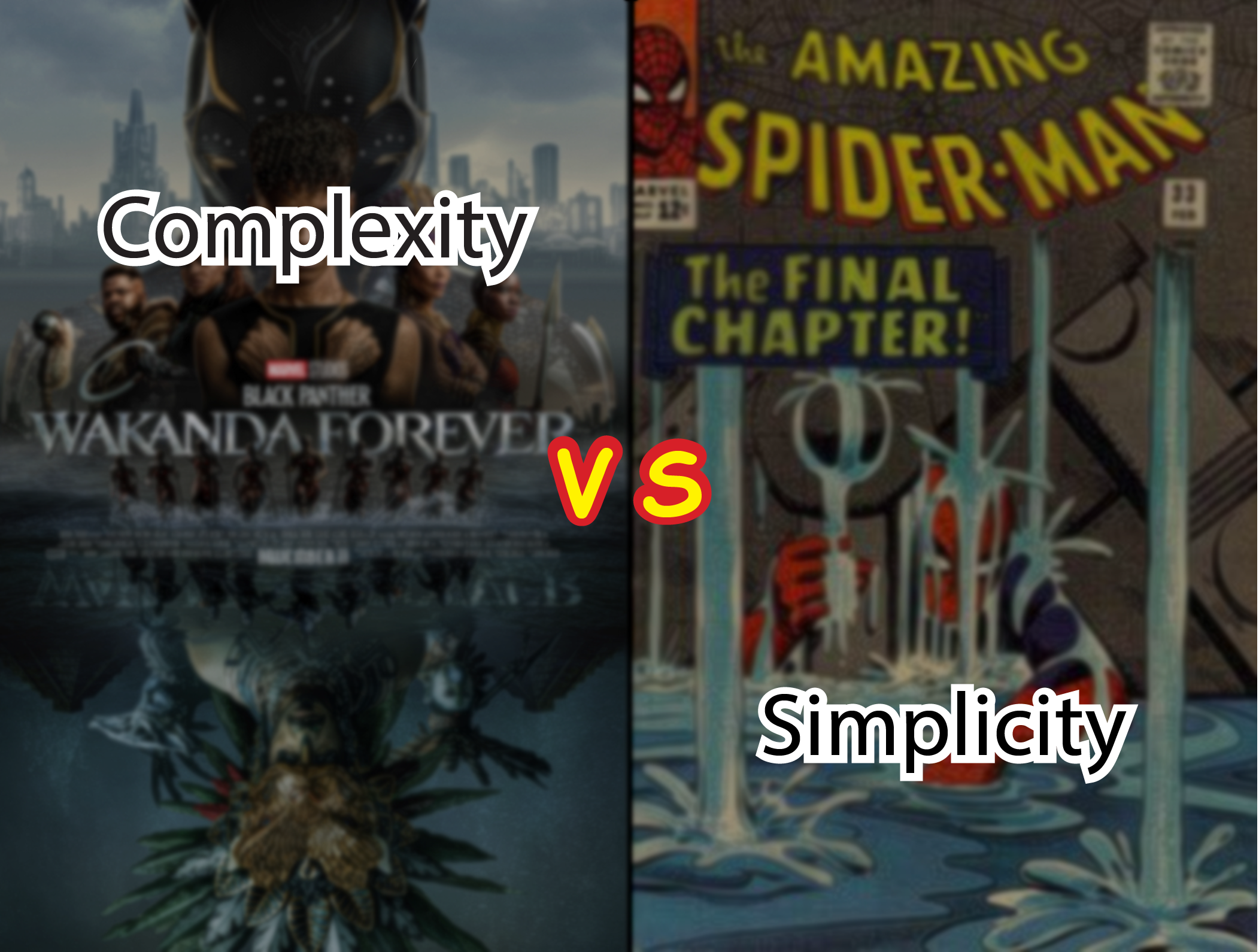
So, when watching “Black Panther: Wakanda Forever,” I was taken aback by the action and how even though it was choreographed well, it still fell flat. I could tell that the actors were making certain moves, but the framing got in the way of portraying what was going on.
If one of the main selling points of the film is the effects, why can’t the viewer tell what is going on?
A similarly muddled mess can be found in modern comic books displaying color gradients and entire pages dedicated to shaded and highly detailed figures.
A clear contrast to this mess can be seen in a famous sequence in “The Amazing Spider-Man” as part of a story called “If This Be My Destiny!” In it, Spider-Man is trapped beneath rubble and struggles to lift it until he remembers that he must save his aunt’s life by getting her a nearby serum. A simplistic plot with clear motivations is told while the details and the specific way it unfolds makes it complex and memorable.
It also helps to have art by Steve Ditko who uses simple linework and selective detail to increase the tension and investment of the reader, panel by panel.
Simplicity works best on a larger scale and complexity is best used to introduce startling and interesting details that serve that larger point – such as a desolate mountain painting utilizing paint that provides a rough texture.
If the basic idea, image, or premise is not too compelling then the foundation is shaky enough to see that it will not create an impression on anybody. If the technical skill is there, even then that will not ensure a work will accomplish its goal.